
The Ultimate Website Launch Checklist for Agency Projects
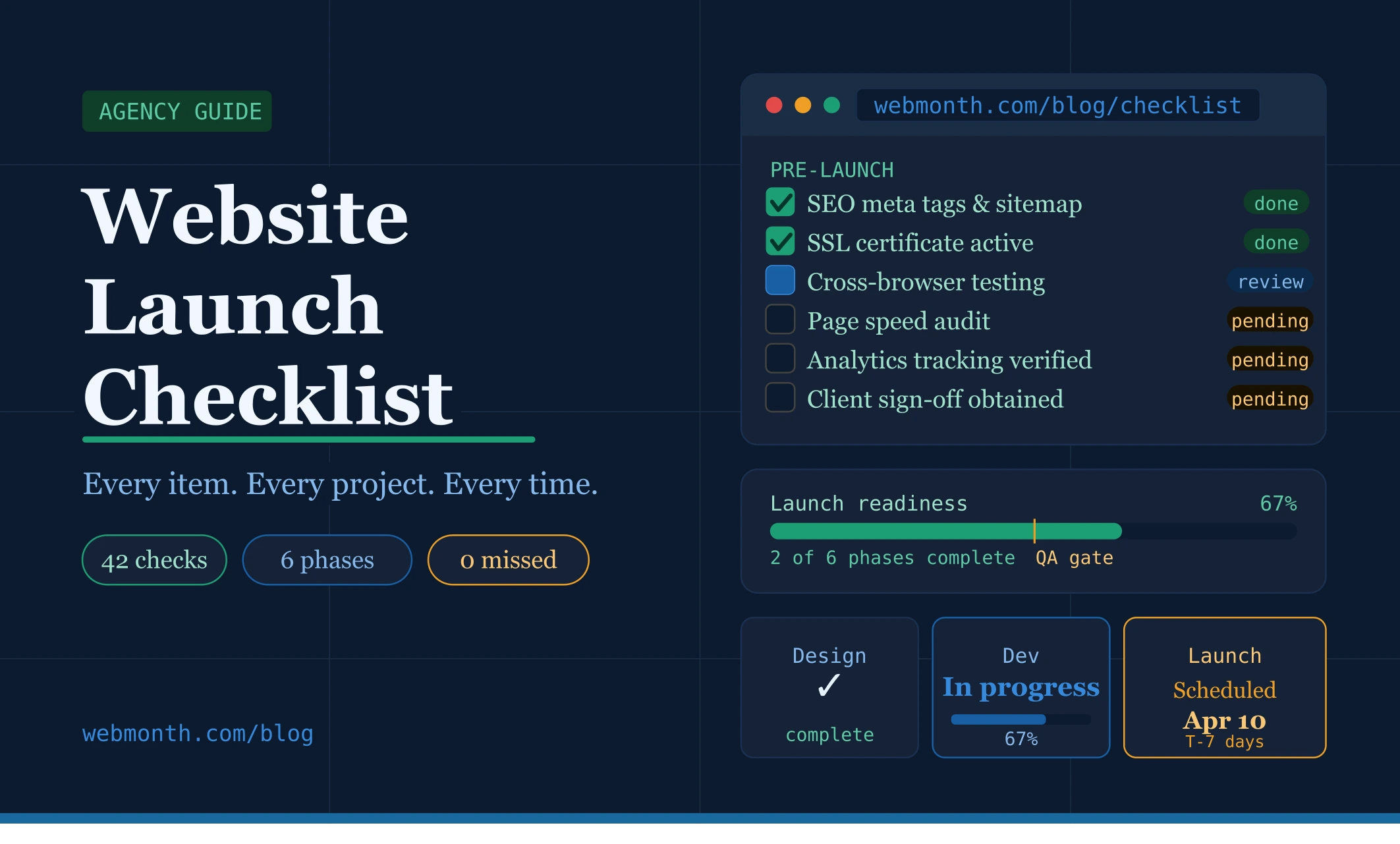
For any US-based digital agency, the final phase of a web design project is often the most stressful. You’ve spent weeks refining the visual identity, perfecting the typography, and ensuring the user interface aligns with your client’s brand. However, the transition from design sign-off to a live environment is where many projects falter. A single missed detail can lead to a damaged reputation and a frustrated client.
At Web Month, we understand that American agencies need to maintain a high standard of excellence to stay competitive. Whether you are a boutique creative shop in New York or a full-service marketing firm in Austin, having a standardized website launch checklist US agency teams can follow is critical for consistent delivery. This guide focuses specifically on the design and aesthetic integrity of your projects, ensuring that your creative vision remains intact during the handoff and launch process.
1. Visual Integrity and Responsive Design Audit
The first pillar of any successful launch is ensuring that the high-fidelity designs approved by the client are perfectly mirrored in the live environment. In the world of white-label web design, the "design-to-development gap" is a common pitfall. Your team must conduct a side-by-side comparison of the original Figma or Adobe XD mockups against the staged site. Check for font consistency, letter spacing, and image cropping that might have shifted during the build phase.
Responsive design is non-negotiable for the US market, where mobile traffic often accounts for over 50% of web visits. Use this website launch checklist US agency step to test the design across various breakpoints. Don't just rely on browser emulators; test on actual iPhones, iPads, and Android devices. Pay close attention to touch targets and ensure that buttons are easily clickable and that the visual hierarchy remains logical even on the smallest screens.
Finally, verify that all brand assets are high-resolution. Retina displays are standard for many American consumers, and blurry logos or icons can immediately make a site look amateur. Ensure that SVGs are used for icons and logos wherever possible to maintain crispness at any zoom level. This attention to detail is what separates premium agencies from budget service providers.
2. User Experience (UX) and Navigation Flow
A beautiful design is useless if the user cannot navigate it intuitively. As part of your website launch checklist US agency protocol, perform a "blind navigation" test. Have someone who wasn't involved in the design process attempt to find specific information or complete a conversion goal. This helps identify friction points where the design might be confusing or where calls-to-action (CTAs) aren't prominent enough.
Check all internal links and navigation menus. In complex site architectures common in US corporate designs, it’s easy for a sub-menu item to lead to a 404 page or a placeholder link. Ensure that the hover states for links and buttons are consistent and provide clear visual feedback to the user. This subtle design element significantly enhances the perceived quality of the website.
Don't forget about the footer. For American businesses, the footer often serves as a secondary navigation hub and a place for critical legal links like Privacy Policies and Terms of Service. Ensure the footer design is organized, legible, and includes updated copyright dates. A well-designed footer provides a sense of closure and professional polish to the entire site layout.
3. Content Presentation and Micro-Typography
Content is the heart of the design, and its presentation can make or break the user experience. Review every page for "lorem ipsum" or placeholder text that might have been overlooked. In the US market, clients are particularly sensitive to typos and grammatical errors, which can reflect poorly on your agency’s quality control. Use this website launch checklist US agency phase to ensure all headlines are properly formatted and that line lengths are optimized for readability (typically 45-75 characters per line).
Typography plays a massive role in brand perception. Check for "widows" and "orphans"—single words or short lines at the end of paragraphs that create awkward white space. Adjusting these small details shows a level of craftsmanship that high-end US clients expect. Additionally, ensure that hierarchy is established through consistent use of H1, H2, and H3 tags, which aids both visual flow and accessibility.
Images and media should be checked for Alt-text. While often viewed as an SEO task, providing descriptive Alt-text is a fundamental part of inclusive design. For US agencies, adhering to ADA (Americans with Disabilities Act) compliance is increasingly important. Ensuring your design is accessible to screen readers is not just a best practice; it’s a safeguard against potential legal issues for your clients.
4. Conversion Elements and Lead Generation Design
Most US-based clients invest in a new website with one primary goal: conversion. Whether it’s a lead gen form for a B2B firm in Chicago or an e-commerce checkout for a brand in Los Angeles, the conversion elements must be flawless. Test every form on the site to ensure that the design doesn't break when error messages appear. Validation styling (like red outlines for missing fields) should be clear and consistent with the overall brand aesthetic.
Review the design of Thank You pages and confirmation emails. These are often afterthoughts in the design process, but they represent a crucial touchpoint in the customer journey. A well-designed Thank You page that maintains the site's visual language reinforces brand trust. Ensure that these pages are styled correctly and provide clear next steps for the user.
Pop-ups and lead magnets should also be audited. Ensure that any overlays are easy to close, especially on mobile devices. Intrusive design that blocks the entire screen can lead to high bounce rates and negatively impact the user’s perception of the brand. Using a website launch checklist US agency standard ensures that these marketing elements are integrated seamlessly without compromising the user experience.
5. Browser Compatibility and Performance Visuals
The US digital landscape is diverse, with users accessing the web from a wide range of browsers and operating systems. While Chrome is dominant, your design must also perform beautifully on Safari (common among Mac/iPhone users) and Edge. Check for CSS rendering issues that might cause layout shifts in different browsers. A design that looks perfect in Chrome might have alignment issues in Safari if not properly tested.
Performance isn't just about code; it’s about how the design is perceived as it loads. Implement lazy loading for images to improve initial load times, but ensure that the transition is smooth. Use "blur-up" techniques or colored placeholders to prevent the layout from jumping around as images pop in. This creates a more premium, fluid experience for the end-user.
Lastly, check the site's favicon and social sharing images (Open Graph tags). When your client shares their new site on LinkedIn or Twitter, you want the preview image to be a high-quality representation of the brand, not a random cropped image from the homepage. This is a vital step in your website launch checklist US agency workflow to ensure the brand looks professional across all digital platforms.
6. Final Handoff and Client Training
The launch isn't just about going live; it's about empowering your client to manage their new asset. For US agencies, providing a clean handoff is part of the white-label experience. Create a simple style guide or "UI Kit" that documents the colors, fonts, and button styles used. This helps the client maintain visual consistency as they add new content or blog posts in the future.
If you are using a CMS like WordPress or Webflow, ensure the back-end is organized. Label sections clearly and remove any unused plugins or themes that might clutter the interface. A clean back-end is a sign of a professional design agency. When the client logs in, they should feel that the site is as organized behind the scenes as it is on the front end.
Schedule a final walkthrough with the client to demonstrate how the design functions. This is your opportunity to highlight the specific design choices you made to solve their business challenges. By following a website launch checklist US agency professionals trust, you can walk into this meeting with total confidence, knowing that every pixel is in its right place.
Conclusion
Launching a website is a complex operation, but for a US-based agency, it is the ultimate test of your brand’s promise. By focusing on visual integrity, user experience, and conversion-centric design, you ensure that every project you deliver enhances your reputation. Utilizing a comprehensive website launch checklist US agency teams can rely on reduces human error and allows your creative talent to shine.
At Web Month, we specialize in providing white-label web design services that help American agencies scale without the overhead of a full-time in-house team. Our processes are built around these high standards, ensuring that every site we design for your clients is launch-ready from day one. By implementing these checks, you can turn the stress of launch day into a celebration of a job well done.